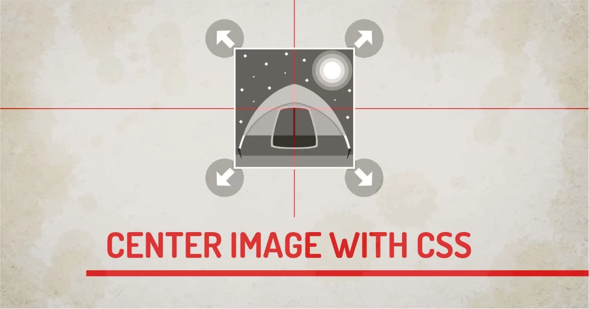
When I started web development, It was hard for me to align the image exactly center in the div. Sure text-align:center; did somewhat work for me but I wasn't so happy at the time.
Since Flexbox was introduced, It took almost all efforts out from old techniques. I'd suggest using only one technique to solve this problem - Flexbox. Using flexbox, we can easily center images vertically and horizontally inside the parent div.
But there are many ways to do the same thing with CSS. I have shortlisted some of the most useful techniques in this article.
1. Flexbox
Using Flexbox properties, we can tell child elements to align themselves properly inside the parent div. This technique works perfectly for space distribution and alignment of children inside.
Nesting Flexbox elements with other flexbox give developers to create a complex layout without worrying about its alignment with its siblings.

How Flexbox Centres The Image
Flexbox uses a very powerful algorithm that understands its' surroundings. So we just have to set flexbox to the parent and apply some properties to make it work.
- display: flex - Tells the browser to use one-dimensional layout control for the element.
- align-items: center - aligns all the child elements to the center of the element vertically. The default value is stretch which will make the image width 100%.
- justify-content: center - When we have more than one element, justify will tell all elements to stay in the center horizontally.
- height: 100%: Sets parent height to 100% (this could be any height)
- Centers All Child Elements
2. Display Table
One of the oldest and most compatible techniques is to use tables or display:table and display:table-cell method. Tables had support for vertical centering since the beginning. We can use the vertical-align property to display data in proper alignment. This technique is a hack and doesn't support text and image centering support together.
By default, text centering is done at the baseline, which may look ugly sometimes.
How Table centres The Image
Table hack used two divs to recreate table and table cell markup. So In parent div, we use the display table to turn on tabular mode.
- display: table - Sets div to use properties of the table. This behavior is mandatory in this technique.
- height: 100% - Sets the height of the table.
- width: 100% - By Default table uses auto width, so we need to make it full width to image bit room for alignment.
In the table, an additional div is used which behaves like a table cell. This needs to be done because vertical alignment is done only on table-cell elements.
- display: table-cell - Enables Cell Mode
- text-align: center - Horizontal Centering for the Chid Element
- vertical-align: middle - Vertical Centering for Chid Element
The combination of text-align and vertical-align will make the image center ligned.
- Text Elements Don't Work With Images
3. Position and Transform
This solution uses modern CSS3 transform property to move an object around. So we can align the image to the center using any of the position property and transforming the image to half of the negative space of their widths and heights using transform. By doing this we'll have a perfectly aligned image with its center origin.
How Position And Transform Centres The Image
It's No magic trick here. But It works great when used with position:relative it works with position absolute, but It can run into an overflow problem is image is larger than a parent.
- position: relative - This is required to move objects in DOM space using left, top, right, bottom options. This option works with position absolute as well.
- left: 50% - Moves Image to the center of the page horizontally. But the Image center is at its left-most point not at the center.
- top: 50% - Moves Image to the center of the page vertically. But the Image center is at the top at this point. It should be at half of the image width.
- transform: translate(-50%, -50%) - This moves the object from its original position to the negative half distance in both horizontal and vertical axis.
4. Position and Margin
The way to use a lazy version of the transform and position method is to replace the transform with obvious values of margins. This is not the most compatible version, But it works for a smaller part of UI where image dimensions are fixed and we don't have to worry about aspect ratio changing often.
How Position and Margin Centres The Image
This technique is similar to using the transform property. This one just uses margins to make the center transition. You have to know the image width and height to make it work because margins and padding don't behave like they should be when used in percentage. Using padding or margin in percentage is the last thing you ever want to do for this task.
- position: relative - This is required to move objects in DOM space using left, top, right, bottom options. This option works with position absolute as well.
- left: 50% - Moves Image to the center of the page horizontally. But the Image center is at its left-most point not at the center.
- top: 50% - Moves Image to the center of the page vertically. But the Image center is at the top at this point. It should be at half of the image width.
- margin:-50px 0 0 -50px - This moves the object from its original position to the negative half distance in both horizontal and vertical axis.
5. Object-fit (Hack)
We can use the simple object property of an image to fake the center-aligned look of the image inside the div. This will be considered as a hack because image will take the entire area of the parent so we can't have a text element next to it.
How Object-fit and Object-position Centres The Image
What this trick does is stretches the image element to the size of its parent. This gives a stretched version of the image. The image is properly placed in the center using object properties.
- position: absolute - This enables sizing and moving of an image possible in parent div
- left: 0% - aligns left edge to left of parent
- top: 0% - aligns top edge to top of the parent
- width:100% - makes width 100%
- height:100% - makes height 100%
- object-fit: none - this will keep the original size of the image, image with and height will be irrelevant when we use object-fit property.
- object-position: center - This moves the image object to the center part of the image.
6. Background-image (Hack but Worth Mention)
It's not an actual solution to the problem but, This method is highly used in industry because it's nonblocking. Image is part of HTML and DOM so when page load starts Image Starts loading.
But if we use an image inside CSS It makes a difference from a performance standpoint. There are Three Methods to add CSS to HTML. With simple CSS rules we can make it appear in the center;
How Background-Position Centres The Image
We have to use CSS to load image in the background and we can align background in center using background properties.
- width: 100% - Streaches Element to 100% width of it's related parent.
- height: 100% - stretches element to 100% height of it's related parent.
- background-repeat: no-repeat - Stops repeating pattern and gives single object.
- background-position:center center - makes background center
- background-size: 100px 100px - This can be size of the image
Final Words
Though there are many solutions to the same problem, Each solution will work in different types of situations, sizes, and possibilities. But personally, I suggest using the Flexbox method. It's just working awesome.